This month we are bringing you some very exciting design inspo, straight from Pantone’s top colors for 2021. Seeing how the color trends change from year-to-year is always so exciting and can definitely spark some creative changes around the home. Whether you’re looking for a daring bold, a calm neutral, or a stunning color combo, we have four inspiration photos to dive into with you today.
Changing it Up
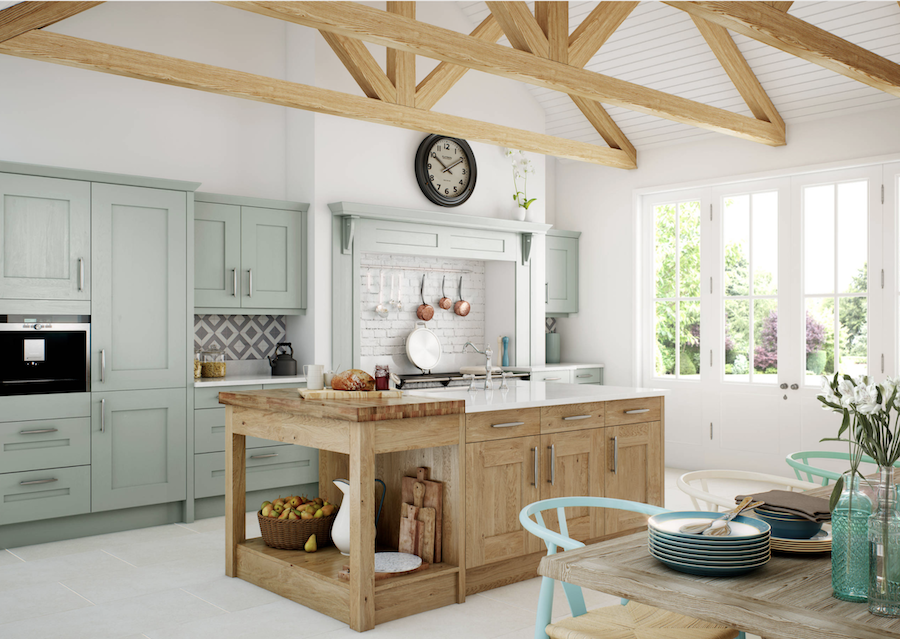
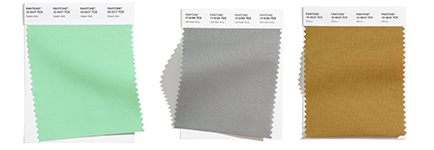
Your home should always feel like your own personal oasis, especially after the year we’ve had. We know that everyone has their own style and also feels calm in different settings and atmospheres. Neutrals used to be considered the calm colors in a home, however we’re now seeing more and more kitchens filled with color. Adding whatever color makes you happy is so important in your space! One stunning option that’s become popular is pairing greens with warm wood tones.
Blue is Always Here, and We’re so Glad!
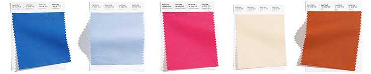
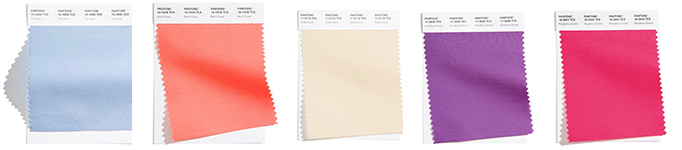
Different shades of blue are always gracing the color trends, and it’s for good reason! Blue can emulate so many different atmospheres, moody, bright, serene, and more. Classic Blue was 2020’s color of the year, and in 2016 we saw a tie between pink and a soft blue shade.
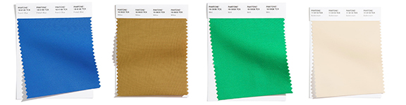
2021 is following in the same path of including blues in the top ten, this year with two shades topping the color charts.
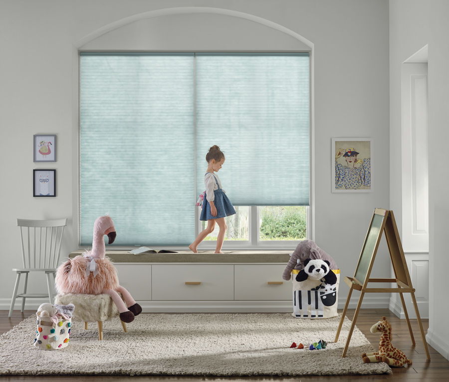
Give Us all the Blue Tones
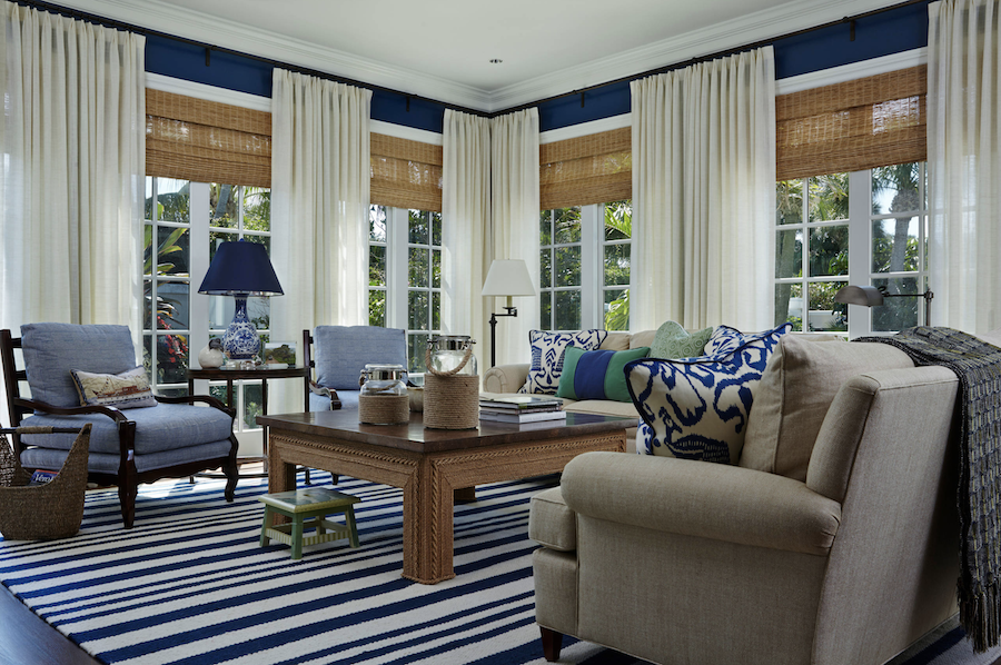
Your home style should be what puts you at peace and makes you feel good every time you enter. Some people are more drawn to contrast, while others gravitate toward more similar colors. No matter which you choose, you can’t go wrong. These patterned roman shades mixed with the solid, darker drapes are a great way to have the best of both worlds! A little bit of contrast, while still sticking with the same color family. Another way to easily change up spaces, maybe for the seasons, is by adding in a pop of color like these pink stems here.
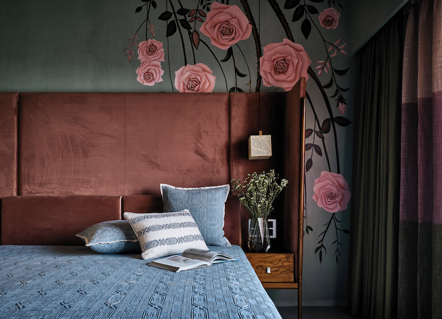
Bring Your Personality In
Your bedroom, of all rooms, should be the room that best shows your personality and makes you feel at ease and relaxed. Adding in textures and coordinating, yet different colors, are a fun way to create a serene space that you’ll love for years to come. Just look at how dreamy the color combo of this light blue and coral in this room.
Which Color Trends are You Leaning Toward?
Which of these color combos are your favorite? Did you find a color that makes you want to refresh a part of your home? We know this can be a big process, but such a fun one too! Our team here at At Home Blinds & Decor is here to help you by topping off your space with the perfect window treatments to fit all of your stylistic and functionality needs. Contact us today for your FREE design consultation.